The Creative Firm
As a creative design firm, we offer services that enhance the visual image of a company, personality, brand, etc. Recently, we have had the opportunity to offer a complete package full-redesign for a local company based in Cork, Ireland. I must say we simply love working on a blank canvas and our client gave us the go ahead to ‘do whatever you think is best’. These are the words that most if not all designers want to hear. This meant that the client placed a great trust in our ability as the designer, but it also raised the standard as we didn’t know what the expectation was going to be!
The pressure is on. Not as a time constraint but as the final product delivery; to create something aesthetically relevant, applying all that we know in relation to design and best practice. In this short piece, I’m happy to share with you some of the process and how we took it from point A to an ongoing point B. As a full re-brand, there are many aspects to it besides the visible company mark.
A company’s brand is the visual representation of what the company is about; their ethos, philosophy as well as their products and services. Placing this blank canvas on us was a challenge but in a very good way. We had full liberty – and we took a stab at it.
The Client
The company in question is PV Generation, a solar photovoltaic (PV) systems provider (I know very technological) and they transform business and residential premises into green energy consumers by kitting them with solar panels and energy management systems. A rebrand implies that they had an existing brand which they did, however, it was less than optimal. I could critique on how it wasn’t effective in the least, but I’ll hold off on that.
Now, how does a good graphic designer approach this? Well, what we did first was ask the client the question?
The Design Package
We wanted to know from the company’s perspective and what made them think of it?
In short, their response matched what we thought about their existing ‘brand’ and that was sufficient to kick-off our design approach.
As our client, they understood early on that this step was an investment and none of the stakeholders were sceptical or in need of convincing that rebranding is more than a new suit of clothes. This made it easier for us as the need to overcome reluctance was eliminated at the beginning.
We began our process. Armed with all relevant information, we had sufficient understanding what was required.
The Design Package
One word that should come hand-in-hand with branding identity is – consistency.
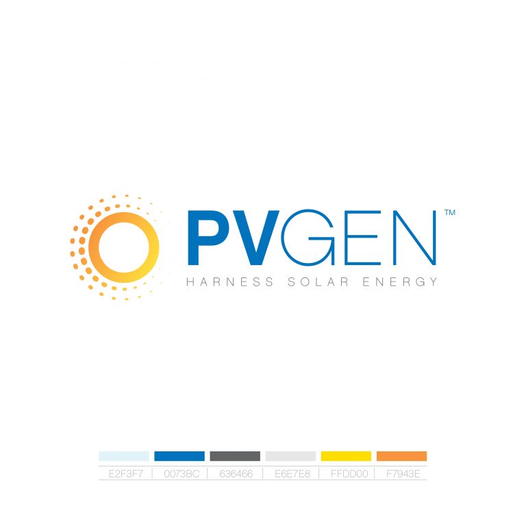
Typically, we think of company name, logo, tagline, colour scheme, marketing material designs, etc. when we hear the word branding identity, and you’d be right. Theses are definitely important elements that frames the structure and strategy of delivering a brand. However, these are not the brand. The brand is the company’s reputation and their visibility not their logo or name.
Their brand as a company is the reputation they had built up by delivering good and quality work. PV Generation’s reputation preceded them and our job was to translate that visually.
The full package proposal included:
- Branding Strategy
- New logo
- Web design & Development
- Analytics
- SEO
- Image re-touching
- Social Media Presence
- Engagements and Promotion
- Brochure Design
- Van graphics design
- Business Cards
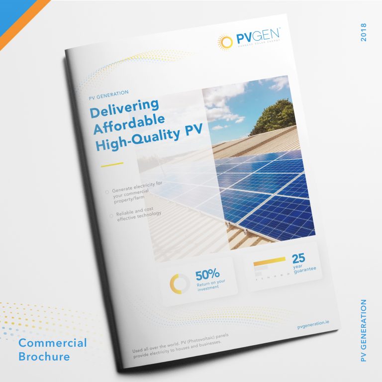
This list crudely outlines the main deliverables however, the work to undertake this was wide and varied. Each aspect warrant a whole book on its own! We applied the principles of design as well as the technical know-how to implement it and that allows us to deliver a successful rebrand.
All in all, our client was well-pleased with what we came up with. It must be said though, that this partnership was made seamlessly possible because the pros were left to do what they do best. There was always room for discussion and inputs. But these weren’t your ‘pretend creative director’ type who would constantly watch over your shoulder and micro-managing the design.